Big announcements 🥁, 2 Plugins, and 7 new Elements
changelog/202224-calendar-date-pickers-progress-bars
Hellooooo there 👋
It's the first time we're writing to you in June 😱
Here's why:
- we're working on a native integration with Supabase,
- your WeWeb web-apps will soon be SPAs, and
- a new data grid element is on its way.

All three are big projects that are taking a bit of time buuuuut... are just around the corner 😉
We'll keep you posted!
In the meantime, we released one new data source (SOAP APIs), one new tracking extension (Segment) and seven new elements we're pretty sure you'll enjoy:
- a loader,
- a calendar,
- a progress bar,
- a progress donut, and
- three date and time pickers.
Let's show you how these work.
The SOAP Datasource Plugin
You can now use SOAP endpoints to create Collections in WeWeb.
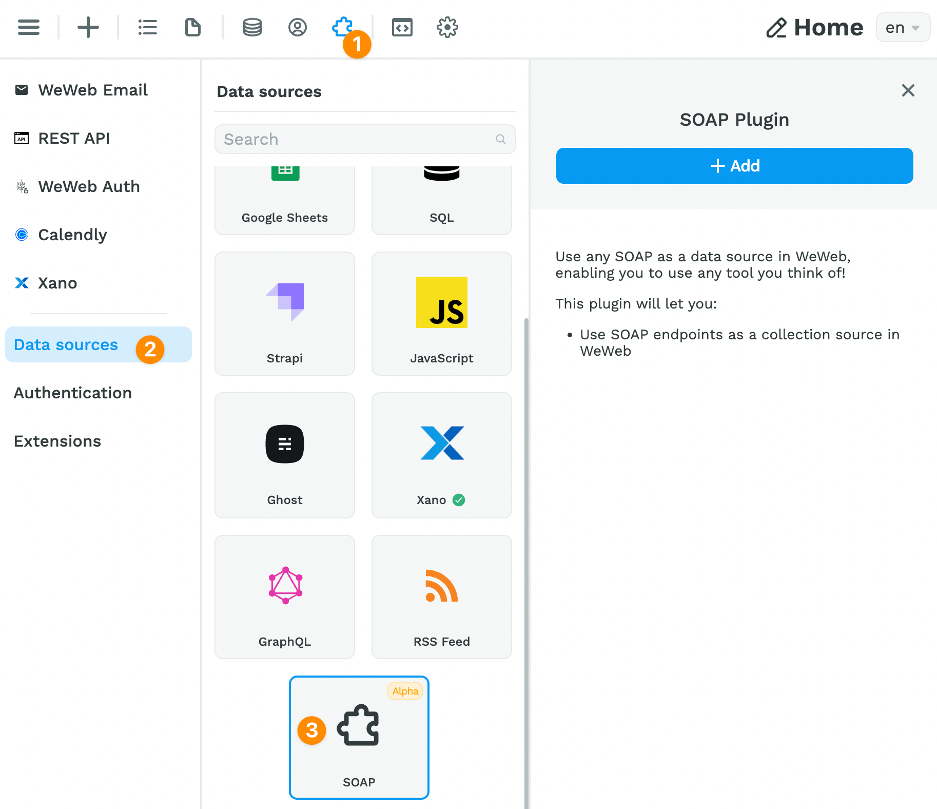
You'll find the SOAP Plugin in the Plugins > Data sources menu:
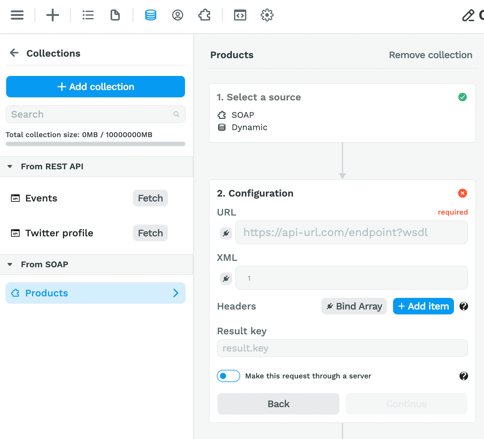
Once you've added the Plugin, you'll be able to add a Collection:
⚠️ Note that the SOAP Plugin is still in Alpha. Please don't hesitate to reach out if anything is unclear or doesn't seem to work as expected! ️⚠️
Now, onto the new Elements in the toolkit! 😀
The Loader Element
At times, your app will be waiting for data from your backend to display in the user interface.
When that happens, it is a best practice to display a loader on the page.
This lets the user know that nothing is broken, they just need to wait a second for the data.
There are two steps to do this in WeWeb:
1- add an Loader Element where you want it on the page
2- bind the display of the Loader and the Element you want to hide to a Variable
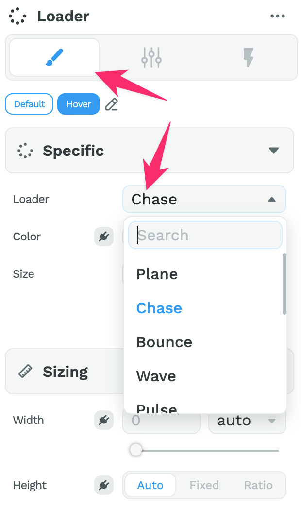
Step 1 – Add a Loader Element on the Page
You can find the Loader Element in the Add > Add elements menu:
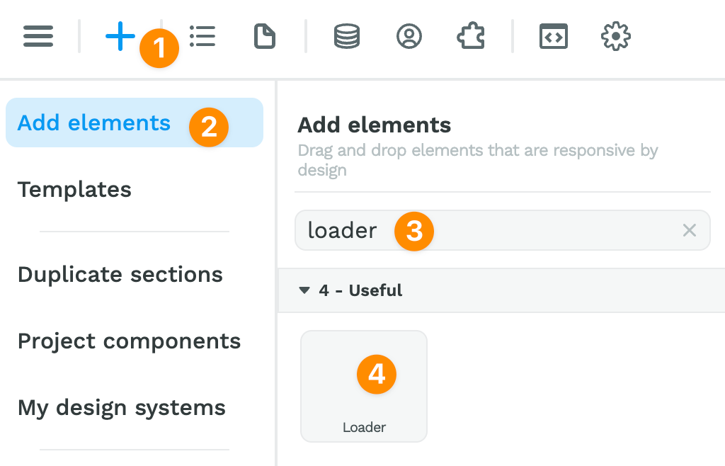
Once you have dragged and dropped the Element on the page, you can choose the type of Loader you would like and style it like you would any other Element:
Step 2 – Bind the Display to a Variable
You will need to bind the display of at least two items on your page:
- the Loader Element, to display it while the data is being fetched,
- the Section(s) or Element(s) you want to hide while the data is being fetched.
How you bind the display property of these Elements depends on your use case.
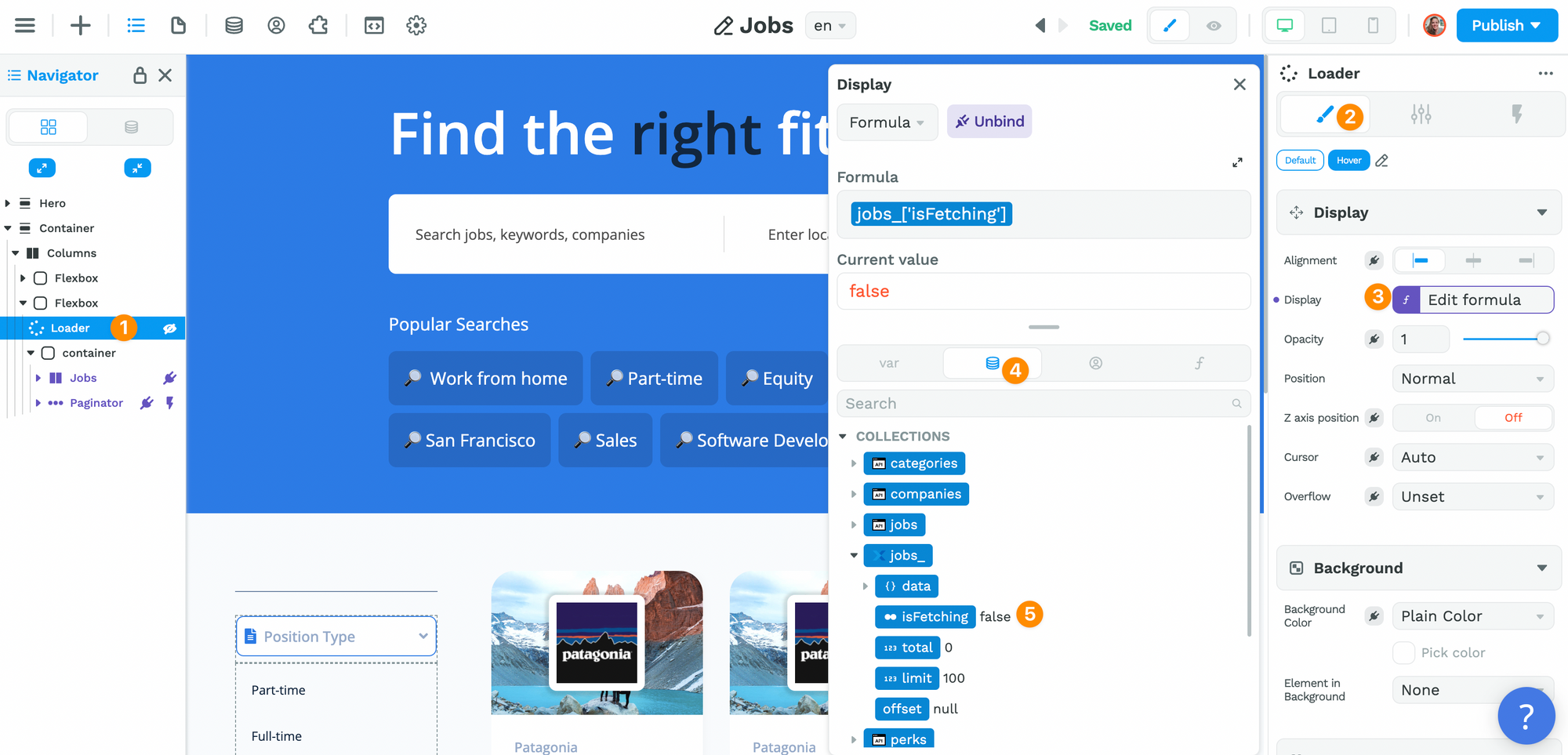
The most common use case: you want to display a Loader while you are fetching the data from a Collection.
If the display depends on a Collection being fetched, bind the Loader Element to the isFetching Variable of that Collection:
You will then do something similar on the container with the Elements you want to hide while the data is being fetched.
Except in this case, you will bind it to the opposite of the isFetching variable by using the not no-code formula:
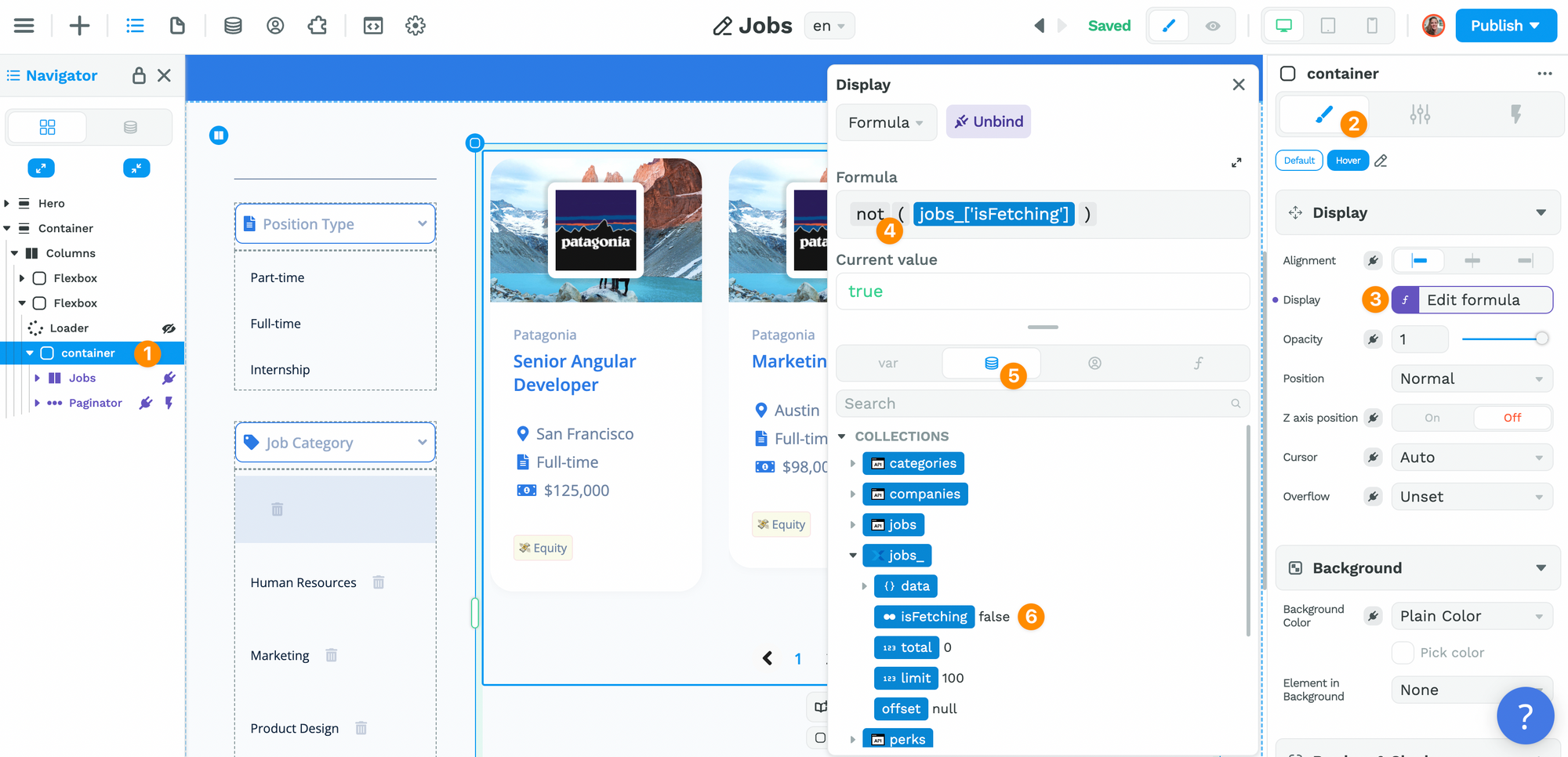
What we are saying is that:
- if the Collection has been fetched already, i.e. when
isFetchingis false, - then we want to display the Container with the data.
Another use case: you want to display content at the end of a Workflow.
This can be very helpful when you have a Workflow with a For Loop iterator that takes a bit of time for example.
If you need to display a loader while a Workflow is in progress, you'll need to create a Variable that is a Boolean, i.e. a Variable that returns true or false:
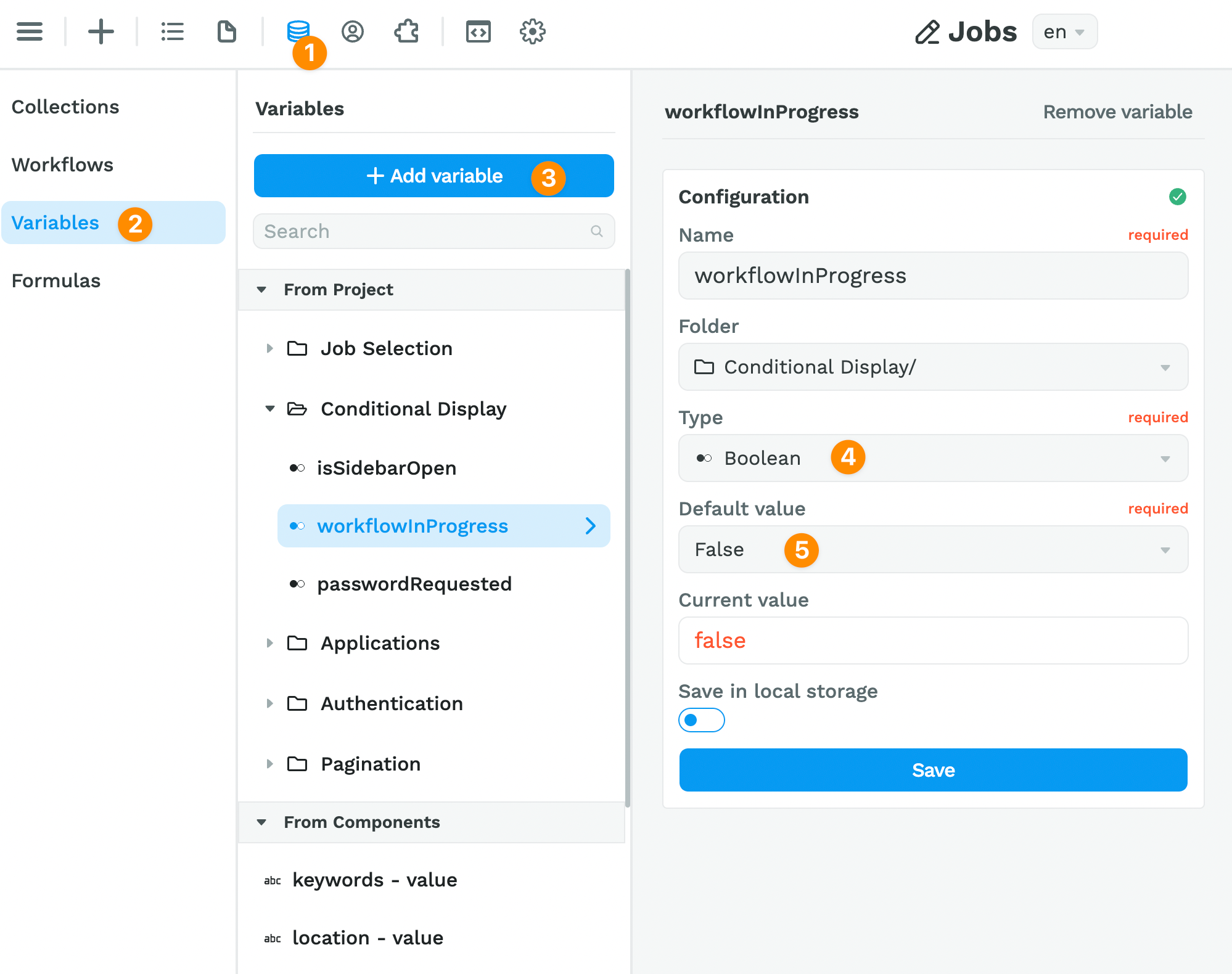
In the example above, we called our Variable workflowInProgress and set it as false by default because, by default, Workflows are inactive. They are triggered by an event.
Then, you can add a display and hide action where you change the workflowInProgress Variable at the beginning and end of your Workflow.
Since it's a Boolean Variable with a default value of false, you could use the not no-code Formula as shown below:
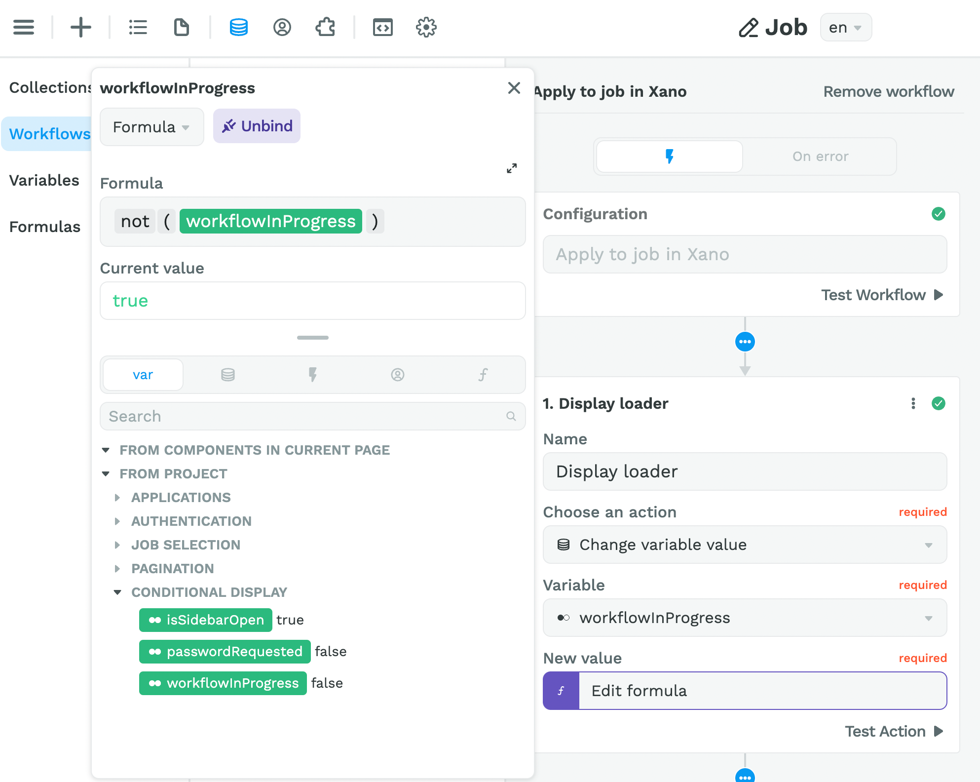
Once that's setup, you can bind the display properties of the Elements you want to show or hide to that Variable 🙂
🔥 Pro Tip 🔥
You'll notice we grouped the Variables related to conditional display in one folder. This helps us debug issues related to conditional display in our app but feel free to organize things differently on your side. Whatever works for you 🙂
The Calendar Element
Ok, on to another cool Element we released recently: the Calendar Element.
You'll find this in the Add > Add elements menu:
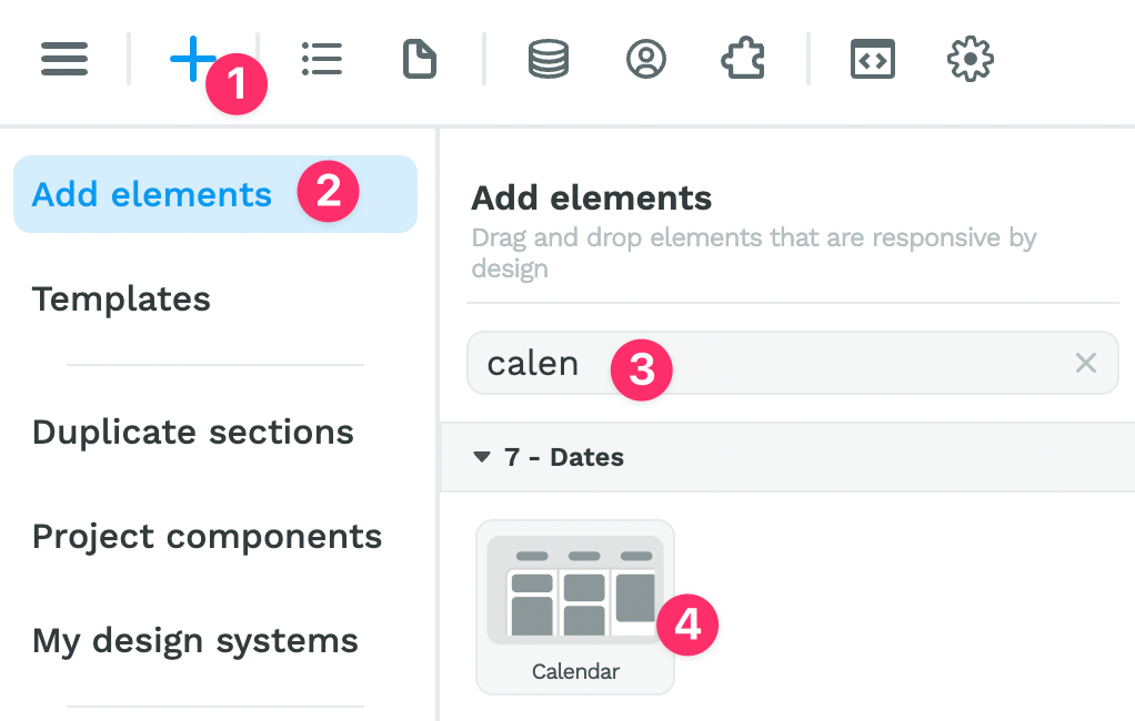
Once you've dragged and dropped it on the page, you'll be able to:
- play around with the style settings,
- change the language of the Calendar, and,
- add your calendars, events, and event categories.
Date & Time Picker Elements
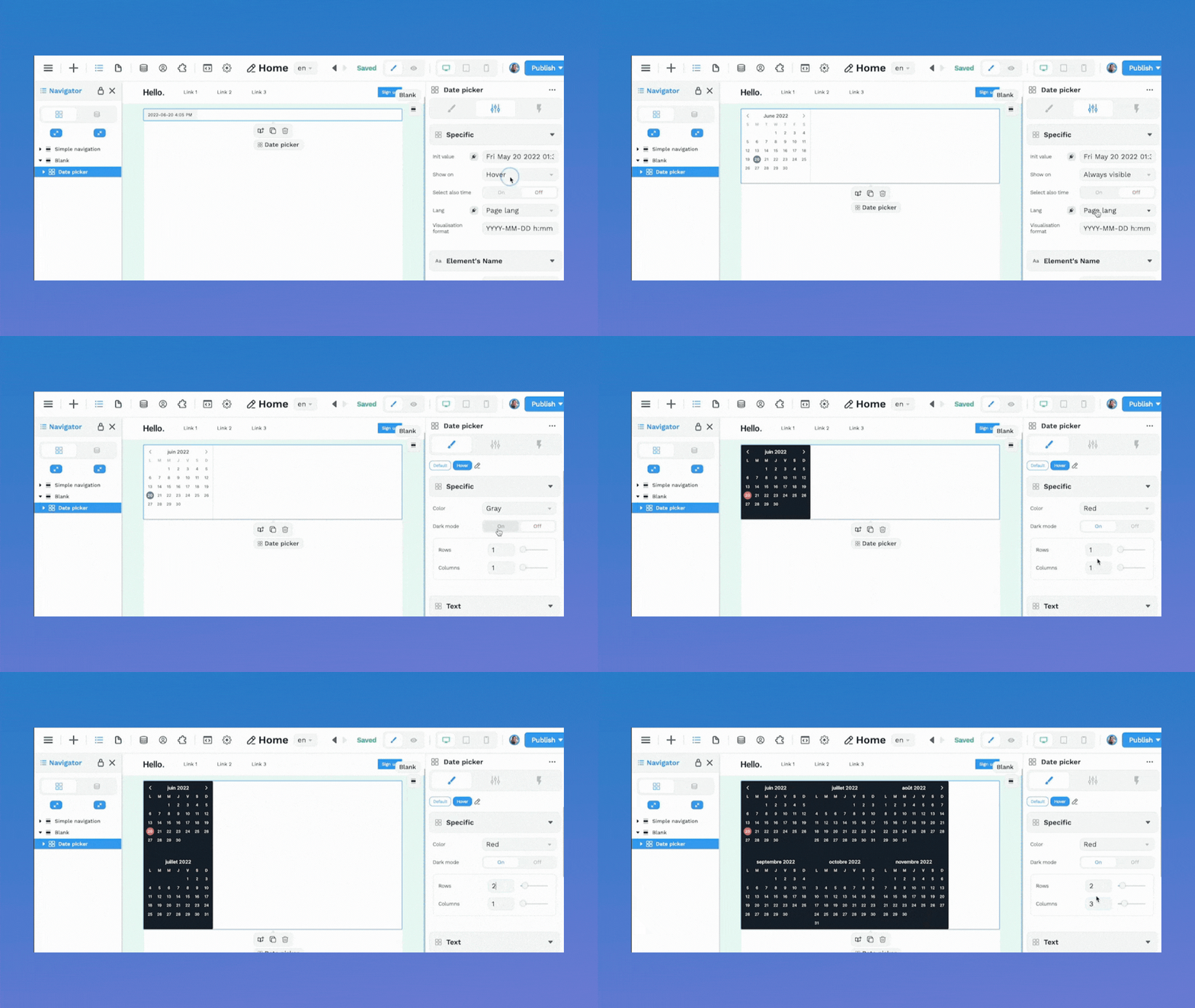
In WeWeb, you have three new date picker Elements:
- one is the "Date Picker" Element which offers a lot more design freedom than the standard HTML "Date Input" Element,
- one is the "Time Picker" Element which is the same Element but with different default settings to save you time, and
- one is the "Date Range Picker" Element which can also be customized and allows users to select a range of dates.
Some things you can do with the new Date Picker Elements:
- display in different languages,
- choose your preferred date format,
- make it visible on hover, on click, or at all times,
- turn on and off the option to also select a time, and
- display one, two, three, or more months at a time.
Standard and Donut Progress Bars
In the Add menu, you can now find two Progress bar Elements:
- a standard, linear Progress bar, and
- a donut-shaped Progress bar.
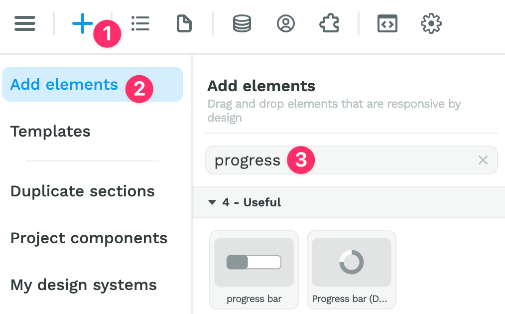
Both Elements are pretty intuitive.
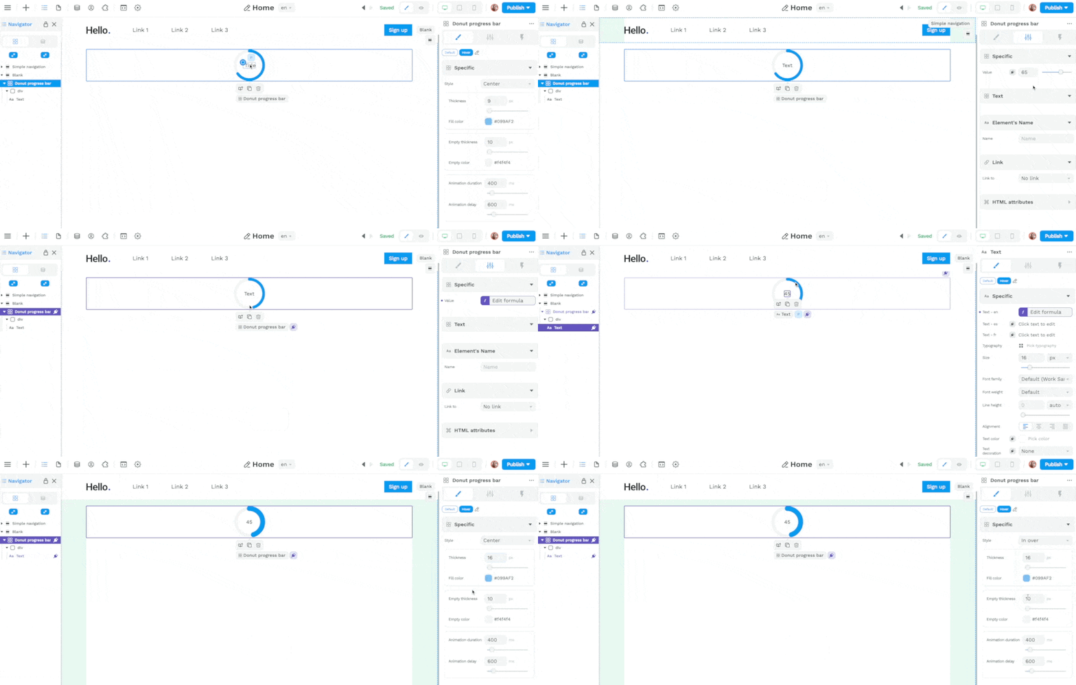
In the example below, you can see a few design options for the donut Progress bar and how to bind the value and text of the Element to reflect the progress made:
Other Improvements
- Developed a native Segment integration Plugin,
- Added option to hide the legend in the Charts Plugin,
- Enabled the binding of x & y positions for toasts and modals, and
- Fixed a big on the Slider Element that appeared on published projects.
That's it for now, we hope you have fun with these new features!
A quick reminder of what's just around the corner:
- Single-Page Applications,
- Supabase Plugin, and
- a Datagrid Element.
Need us to prioritize a new feature?
Suggest or upvote items on the WeWeb public roadmap.