🎨 Intro to the Editor
302
The WeWeb editor is where you can visually manipulate all your HTML and CSS.
It is made up of 3 sections:
- the top navigation menu,
- the canvas in the middle, and
- the right panel.
1- Navigation Menu
The navbar at the top is where you can go back to your dashboard or access project settings.
Hamburger Menu

Use the hamburger menu to:
- go back to your dashboard,
- view your project’s publish history, or
- set up a custom domain name for your project.
Add Menu

Use the add menu to add elements or sections to your page.
In this menu, you will find:
- standard web elements that are responsive by design (e.g. flexboxes, buttons, images, form containers)
- template elements and sections that have been styled (e.g. navbars, call-to-action sections, pricing tables)
- elements that are specific to the plugins you’ve added to your project (e.g. authentication)
- saved sections from your workspace’s design system
Navigator

In the WeWeb navigator you can access:
- elements: the HTML tree structure of your page, and
- variables: the list of variables of your project.
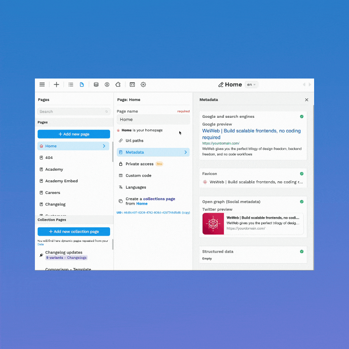
Pages

In the Pages menu, you’ll be able to:
- search existing pages,
- add new pages and collection pages,
- edit page information (e.g. metadata, URL, favicon, languages)
- gate content based on roles and permissions
- add custom code at page level
Data

The data menu is where you can:
- add data collections, i.e. retrieve data from Airtable, REST APIs, GraphQL, etc.
- create variables
- access variables that are automatically created when you use a specific plugin (e.g. auth token or user profile) or element (e.g. a form, search, or select dropdown element)
- create functions
- access functions that are automatically created when you use a specific plugin (e.g. Airtable or Auth0 actions)
This is where a lot of the WeWeb magic happens 🙂
User

In the user menu, you can see the current user’s uploaded files and handle user roles and permissions when using the WeWeb authentication system.
Plugins

The Plugins menu is where you’ll find all the available WeWeb plugins.
We continuously add to the list of plugins. The most popular include:
- Data sources, like Airtable and REST APIs
- Authentication systems, like Auth0, Xano, and JSON Web Tokens
- JS libraries, like Chart.js
Dev

The developer environment is where you’ll find the list of elements, sections, and plugins available for developers in WeWeb.
Settings

The Settings menu is where you can add and manage the following at project level:
- images, files, and icons
- fonts, typography, and colors
- languages
- custom code
- redirections
- base tag
2- The Canvas
The Canvas is the great big part in the middle. It’s where you can interact with the page in real-time.
You can select elements, move them around, and edit content right on the page.
The layout of everything you build in the Canvas follows the box model with sections and elements that are responsive by default.
It ensures that we’re generating clean, production-ready code.
You can edit and preview this on three different views – desktop, tablet, mobile – and publish when you’re ready.

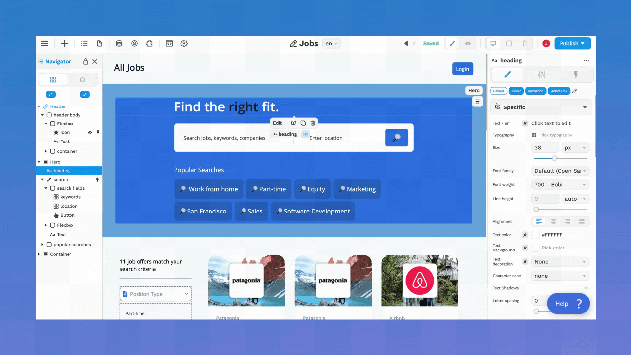
3- Right Panel
The panel on the right gives you precise control over the element that is selected on the page.
It allows you to:
- style the element,
- bind data to the element,
- change settings that are specific to that type of element,
- add no-code workflows on the element.
Style
The style panel gives you immediate access to all your CSS. You can manipulate these values in real-time.
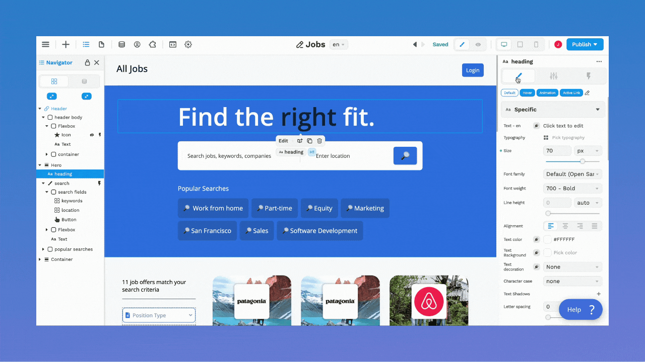
Instead of doing guess work to add box shadows, you can go in and manipulate your CSS visually.
You’ll spend less time switching back and forth to tweak your code and more time focusing on the design and functionality
Bind data
You can bind data to almost every element in WeWeb. The right panel is where it happens.
You can bind a list to a container.
In the example below, we bound a list of job categories to a Collection List:
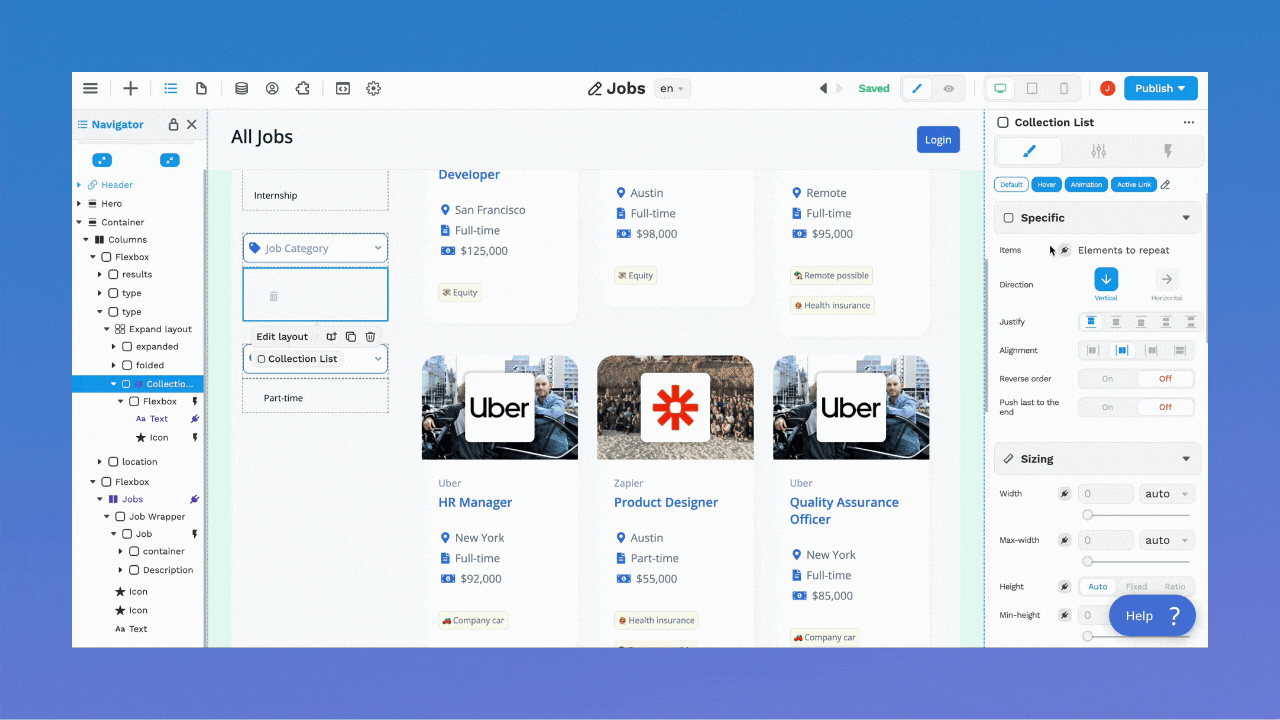
💡 Pro tip: when you bind a list to a container, you can bind the first child of that container to the repeated items in that list.
In the example above, you can see in the navigator on the left that the first child is a Flexbox that contains:
- a text element,
- an icon element.
Even though there’s only one text element and one icon element in the navigator, there are five repeated items in the page, i.e. as many repeated items as we have in the list we bound to the container: human resources, marketing, product design, quality assurance, and software development.
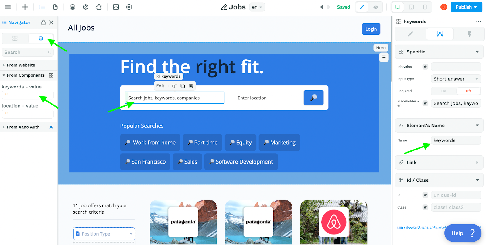
Settings
In the Settings tab of the right panel, you can:
- give a name to the selected element
- add an id or class to the selected element
- link the element to another page or URL
💡 Pro tip – renaming elements is especially useful:
- to get a better view of your HTML tree in the navigator, and
- to work with input field variables
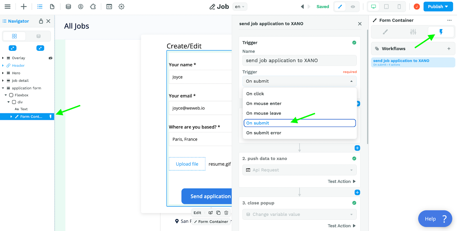
Workflows
In the Workflow tab of the right panel, you can add workflows on an element.
For example, you can add a workflow on a form container element with an "On submit" trigger:
Another common use case for workflows, allow users to click on an element on the page to select, save, modify, or delete an item.
In the example below, we added a workflow when the user clicks on the star icon. This action triggers the following:
- the job id is saved in a local variable,
- the URL of the star icon changes, and
- the user’s profile is updated in our backend.When you’re ready with your design, you can learn how to set up this specific use case here.