🍞 Modals and Toasts
334
In the article below, we will explain how you can:
- Add a Modal Element
- Choose how a Modal appears on the page (position and animation)
- Change what the Popup looks like
- Hide or display a Popup based on user interaction
- Force the display of the Popup when working in the Editor
🔥 Pro Tip 🔥
We removed the Toast elements from the toolkit to keep things simple but you can easily use the Modal Element to create toasts.
The video below will be updated in due course to reflect changes in the product. In the meantime, we think it's still helpful to visual learners.
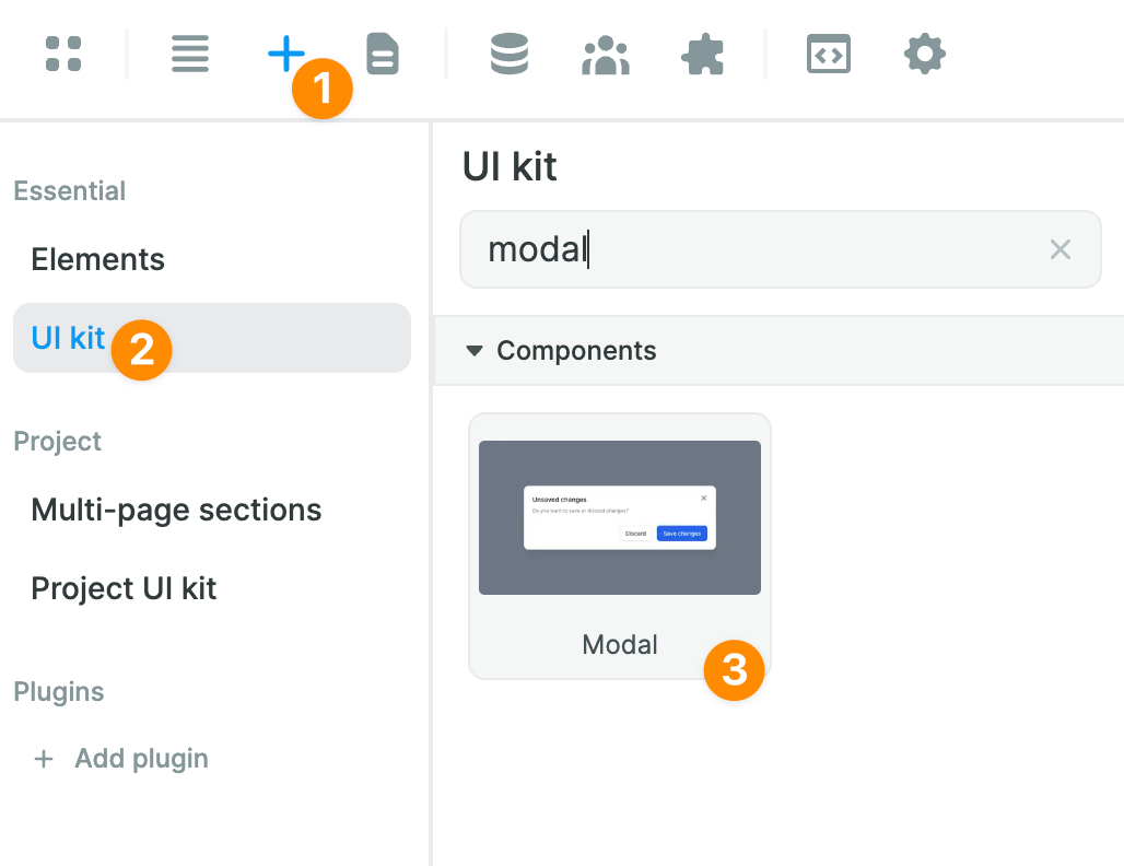
Adding a Modal
In WeWeb, you can find modals and toasts in the “Add” > “UI Kit” menu:
Choosing a Modal’s Position and Animation
When you drag and drop a modal on the Canvas or in the Navigator, it creates a new “Full Height” section with a Form Container.
In the style settings of the section, you can change the “Position” and “Animation” properties of the popup-up to determine how the pop-up appears on the page:

Changing the Appearance of the Popup
You can change the appearance of the modal by modifying the style of the “Flexbox” inside the section.
In the example below, we change the height property of the modal:

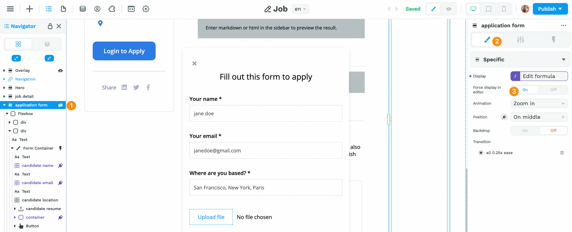
Hide / Display a Popup Based on User Interaction
Modals and Toasts are rarely meant to be seen all the time.
Chances are, you want to hide them or show them based on what the user does or right after a user lands on a page for example.
In order to do that, you'll need to:
1- bind the display of your Modal to a Boolean Variable, and
2- change that Variable to true or false with a Workflow, when a user clicks on an icon for example.
1- Binding the Display of the Modal to a Variable
When you drag and drop the modal on the Canvas, the display is on by default so you can see and edit the modal easily.
However, you’ll probably want to hide the modal by default and show it only when a user has a specific interaction with your web app. For example, when they click on a button.
To do that, you’ll first need to create a boolean variable that is false by default:

If you plan to work with several modals in your project, we recommend choosing a name that is fairly descriptive.
Then, you can bind the display property of the modal to that variable:

2- Adding Workflows to Display or Hide Popup
Once the display property of the modal is bound to a boolean variable, you can add workflows that will change the value of that variable based on user interaction.
In the example below, we added a workflow to an “Apply to job” button. When the user clicks on the button, it triggers the workflow and changes the “applicationPopup” variable to true:

After triggering the display true of the popup, we want to trigger the display false of the popup when the user clicks on the little X icon in the top left of the modal.
In order to do that, we select the Icon element in the navigator and create a new workflow that changes the variable back to false:

That’s it.
You can now change the design of the popup in whichever way you like, add input fields to the form container, add an image, change the background color. Anything.
🔥 Pro Tip 🔥
You can force the display of Modals in the Editor. That way, you can edit your design more easily without switching back and forth between Preview and Editor mode.